The corporate design of the Adobe MAX Creativity Conference 2017 was developed in our Düsseldorf studio and brought to life by means of various physical processes. An appearance consisting of a labyrinth font and a constantly changing, ephemeral logo became the face of the world’s largest creative conference in Las Vegas.
Brief
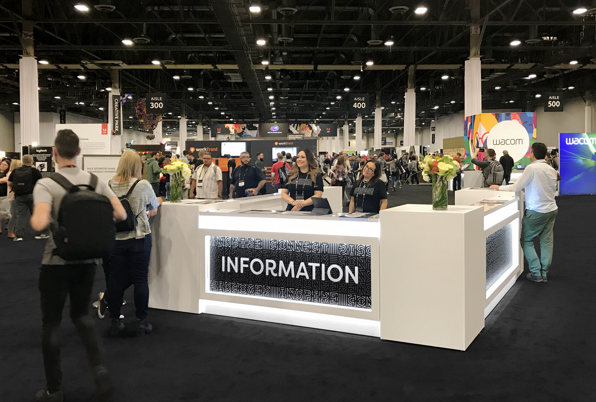
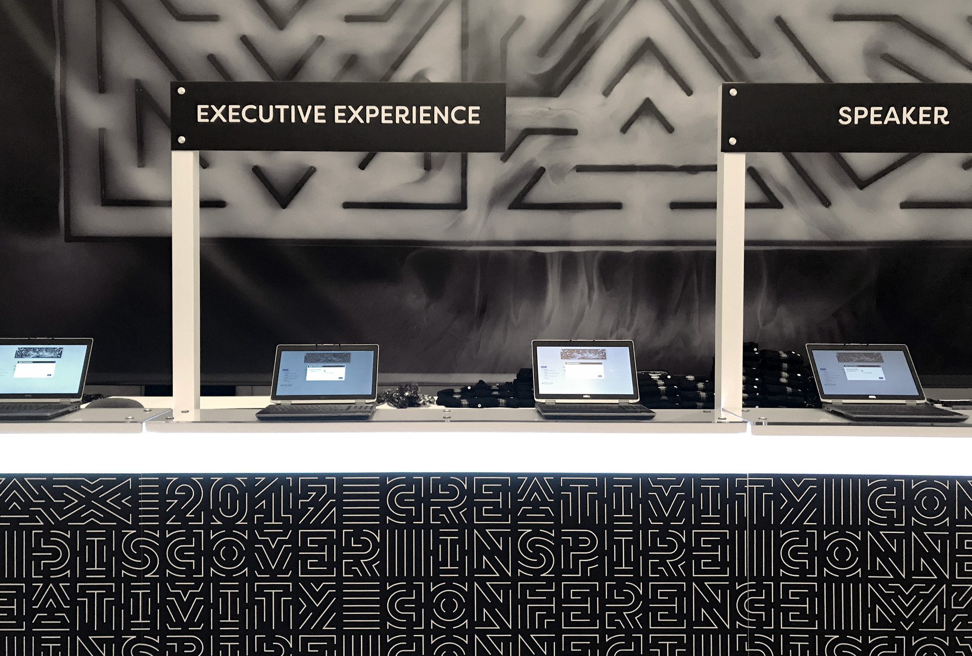
Conception and design of font and logo as a modular system for six different application variants for cinematic and photographic staging. The films and photos will serve as the basis for trade fair banners and displays, websites, social media teasers, print products and merchandising articles.
Concept
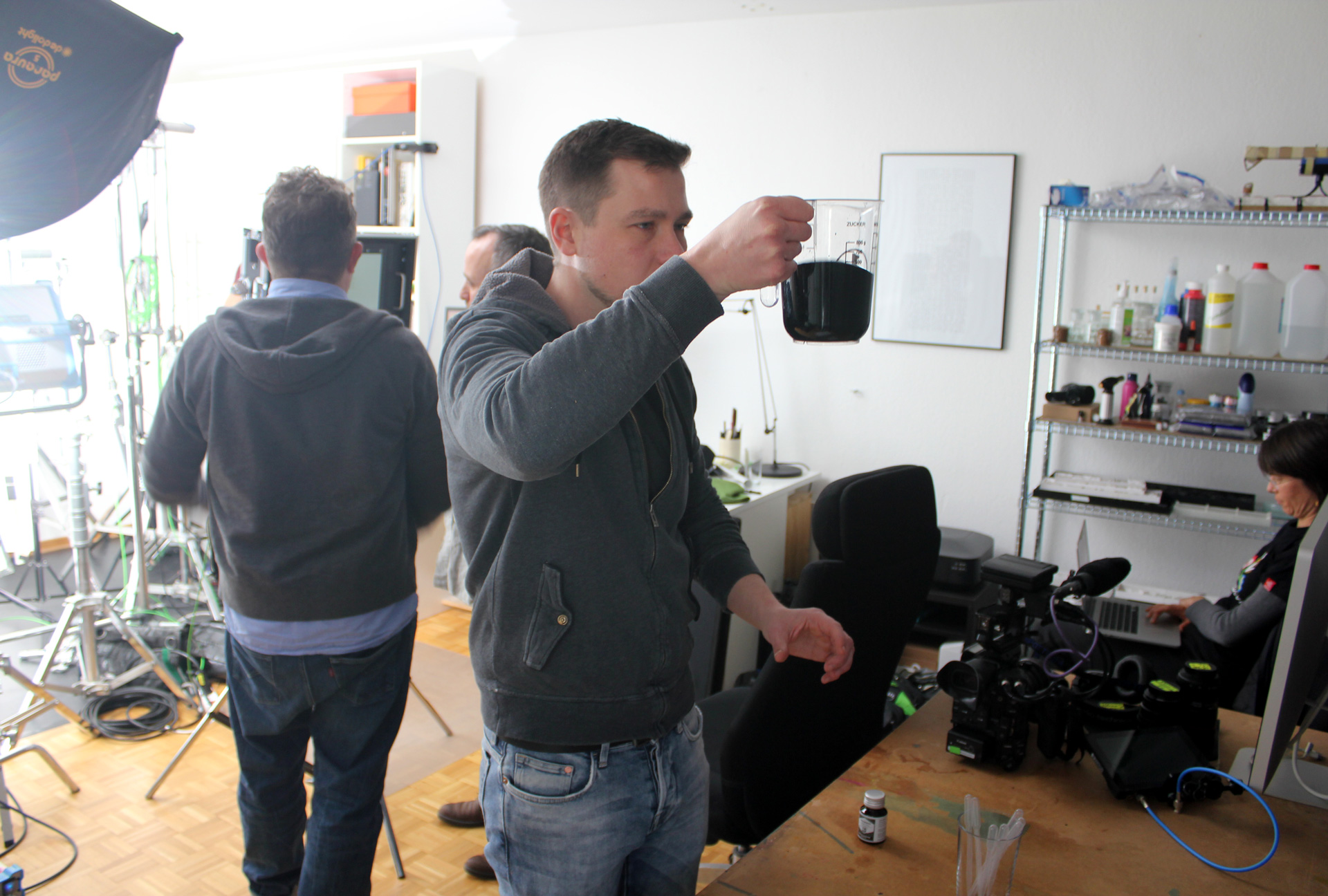
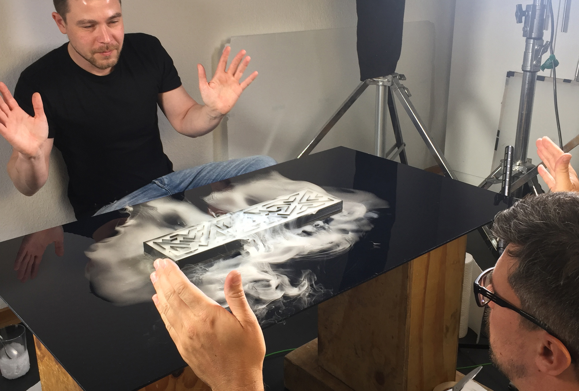
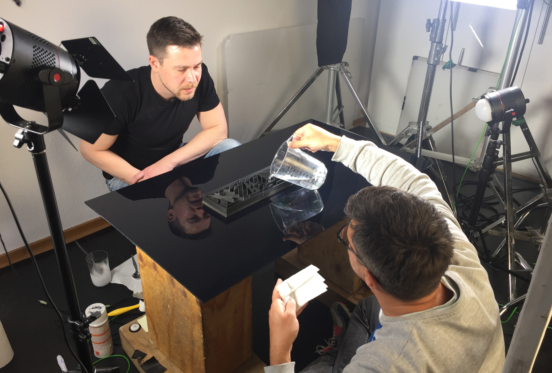
As a framework and “stage” for various physical processes, the logo construction favours the distribution of fluids. Three analogue effects each on black and white backgrounds not only give the logo a changing appearance, their dynamic flow behaviour also forms a contrast to the static architecture of the logo.


Their appearance is based on the previous master thesis By the Way. For the conference, the font developed here was extended and methodically applied to the design of the MAX logo, in which six different analogue processes create a constantly changing overall impression.

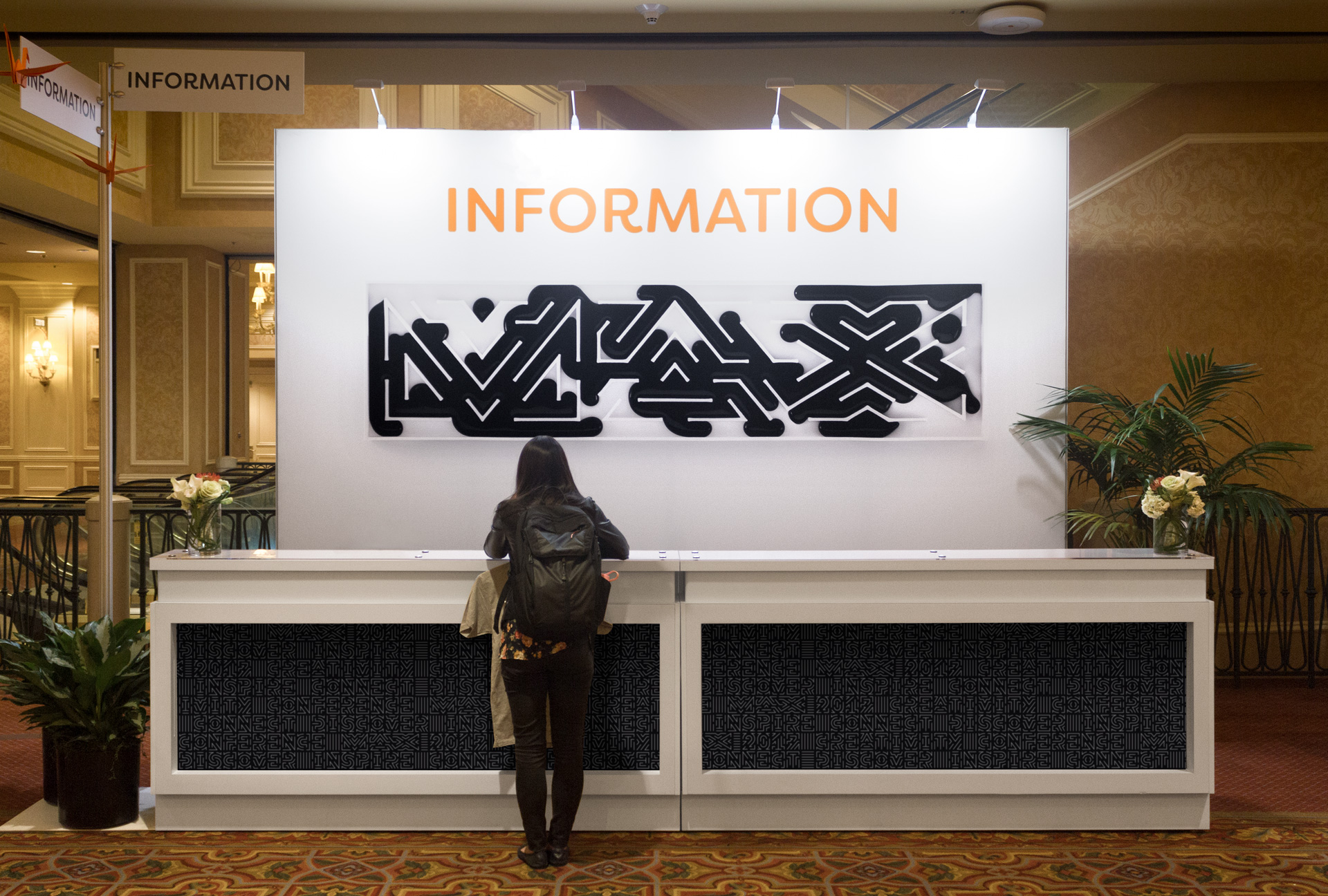
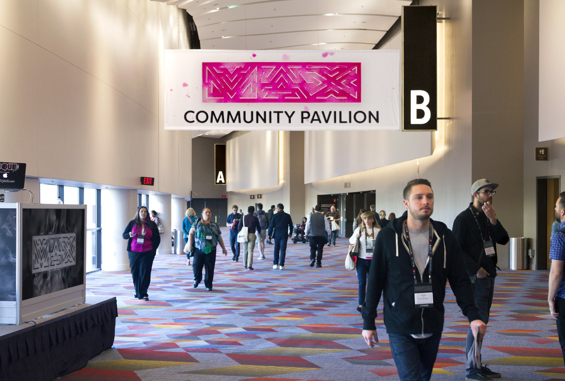
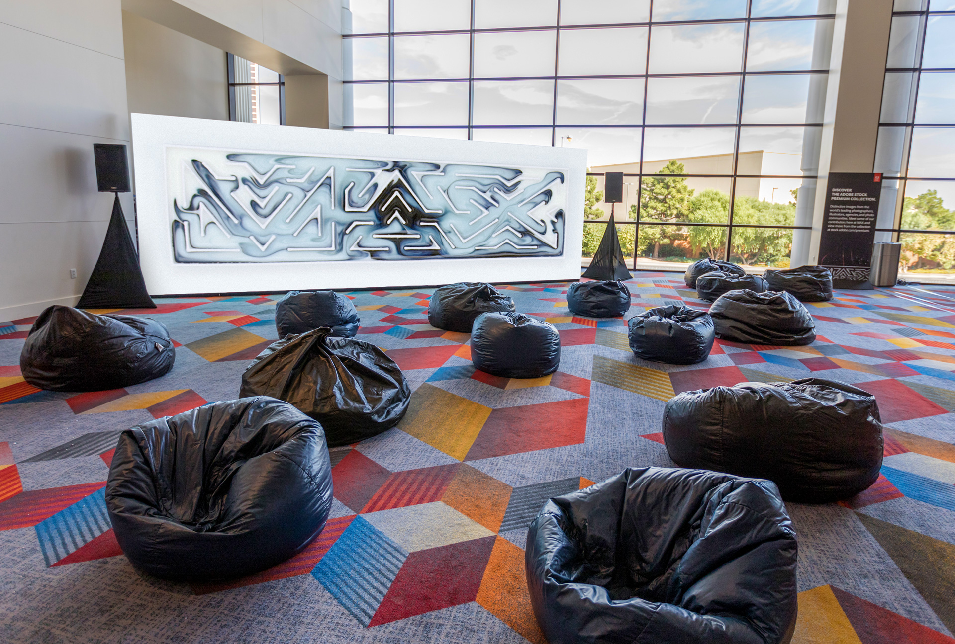


In the exhibition halls of the Venetian Hotel in Las Vegas, banners and displays with burning, exploding, flowing or vibrating logo variations accompanied visitors through the conference.


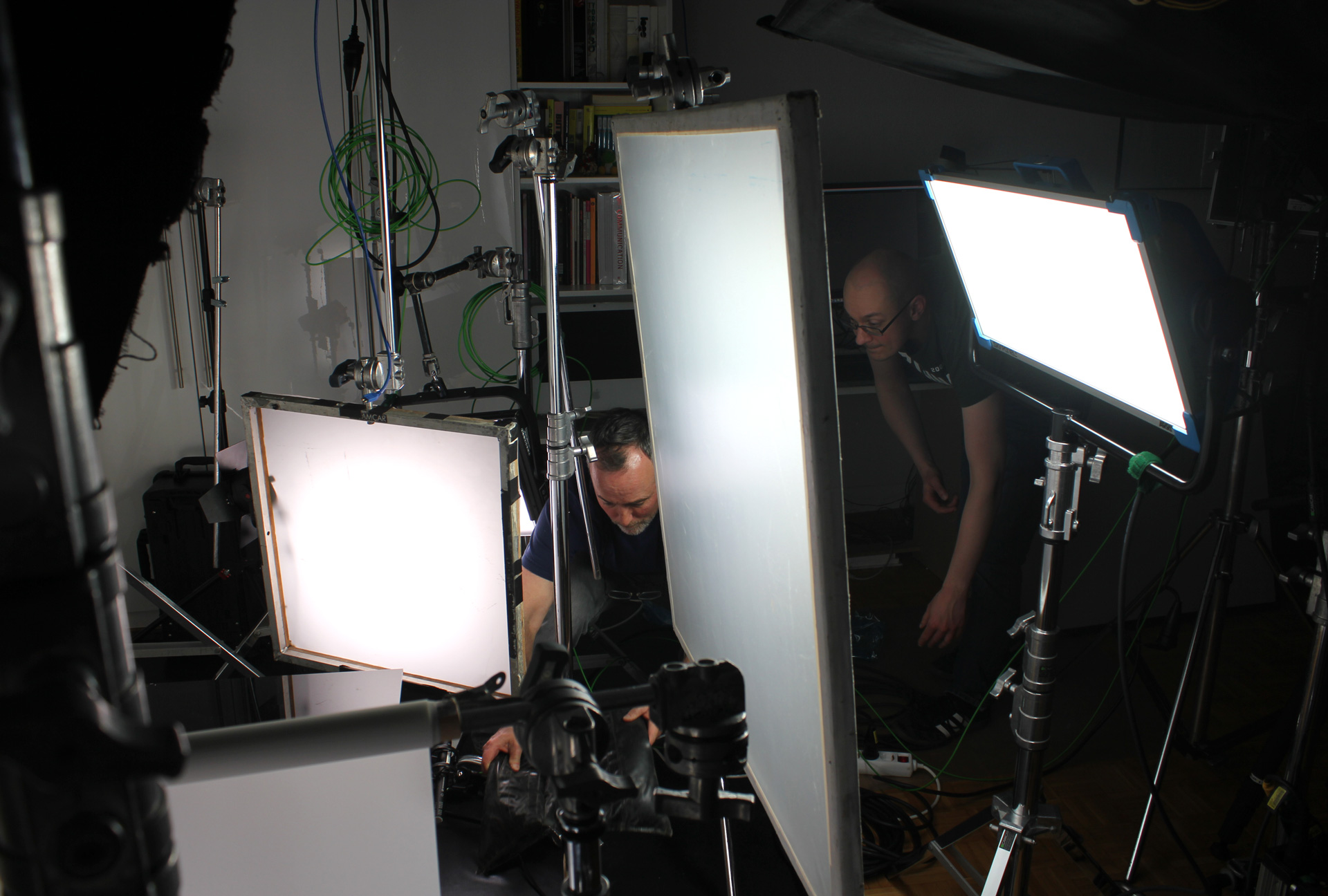
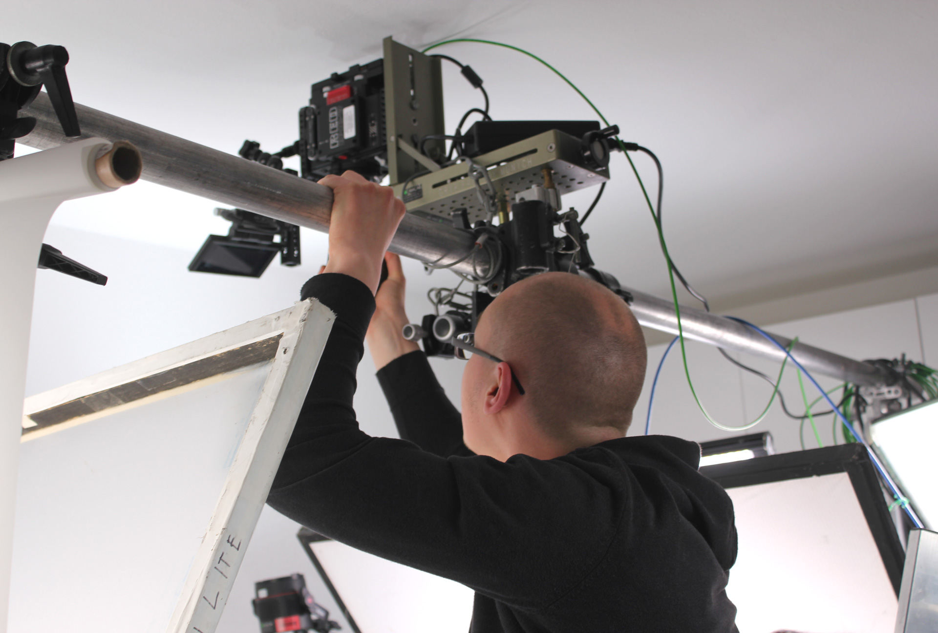
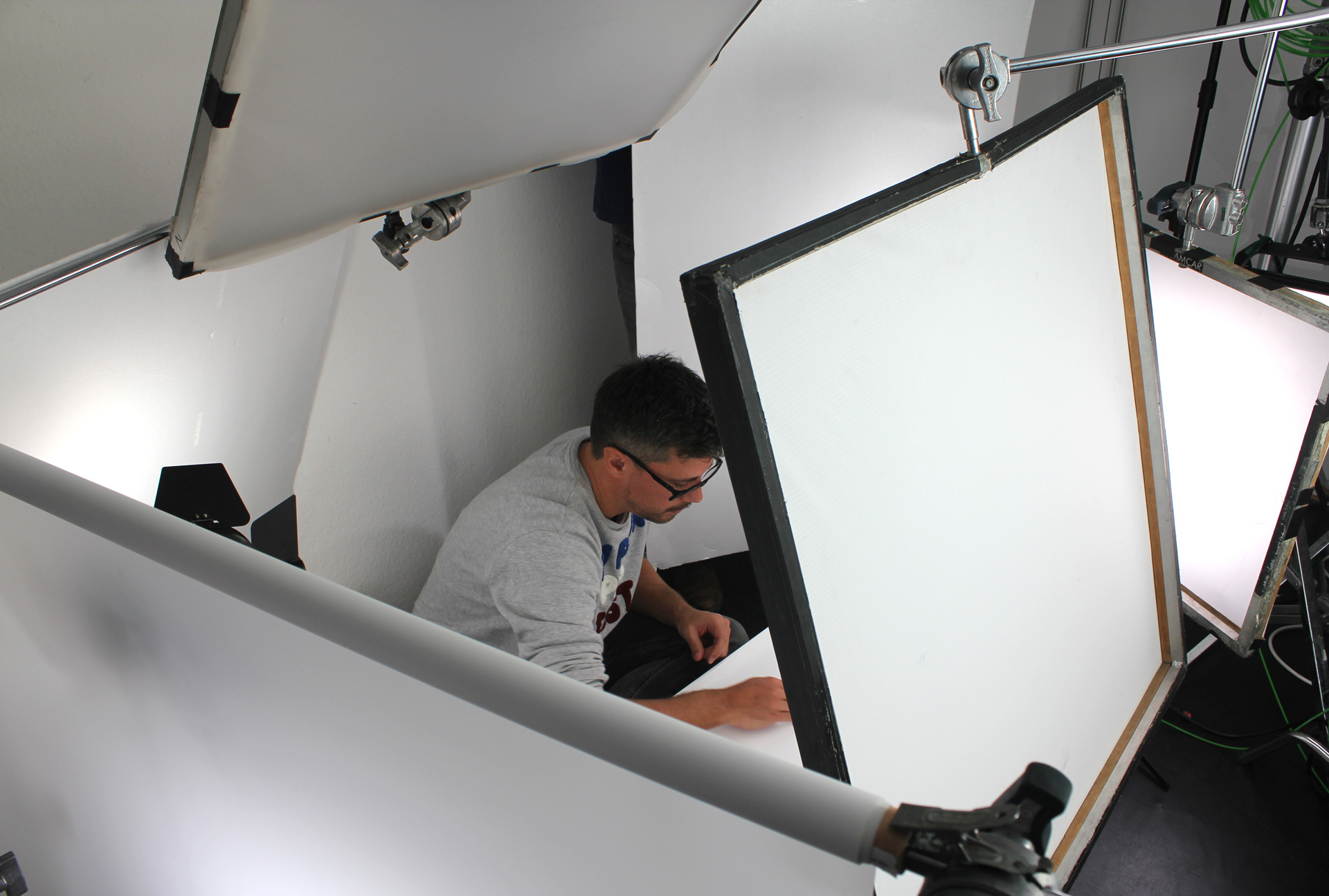
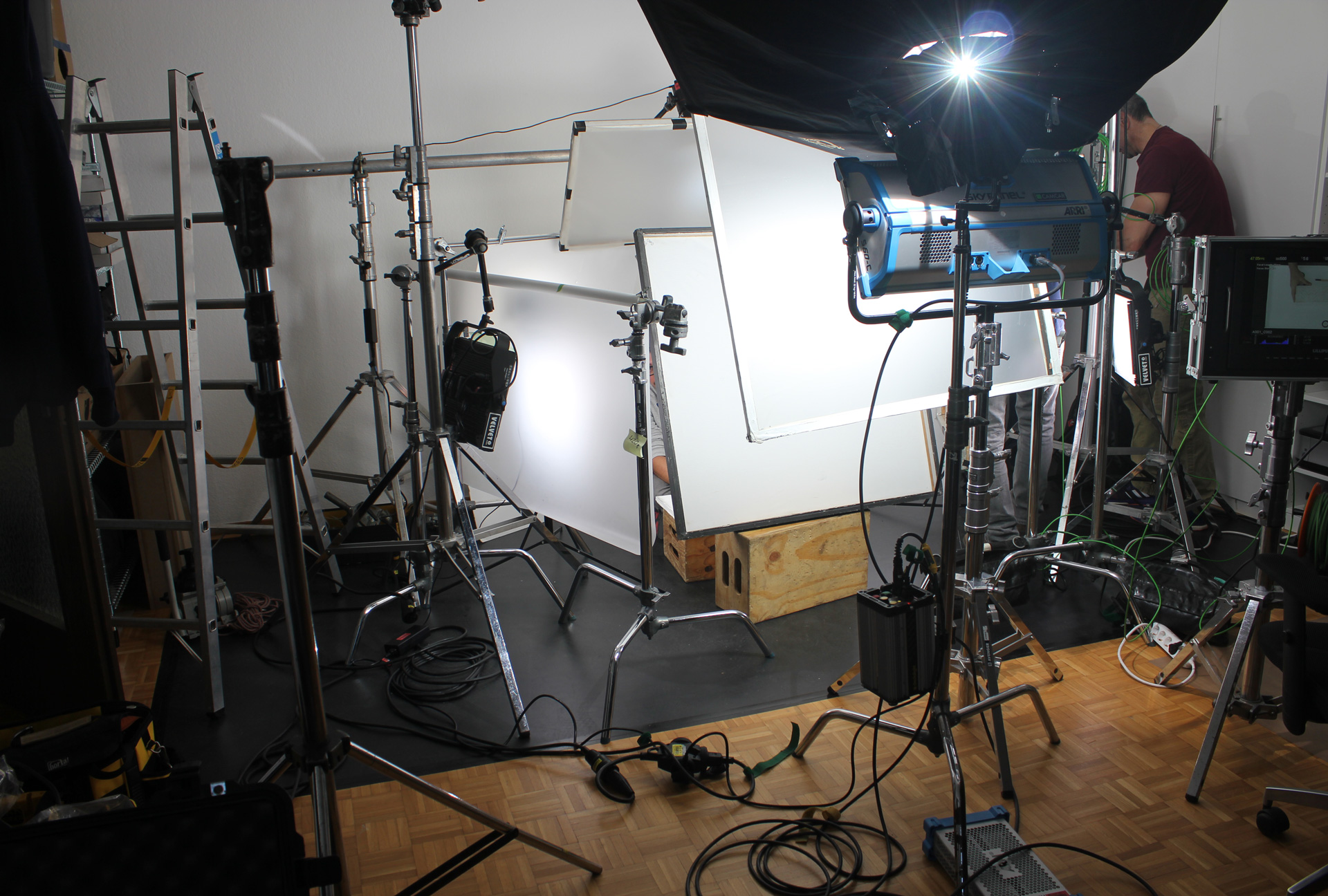
A team from Adobe San Francisco filmed and photographed the experiments on four exciting days of shooting in our Düsseldorf studio.
Create Magazine